Dedicated fitness trackers: Are they worth the money?
HELLO!
I’m Tyler Morgan-Wall, my goal for this blog is to bring you in-depth analyses delving into the details of our data-rich lives in order to make some sense out of all the junk out there (i.e. the name of the blog). The tools I’m using are R, RStudio + Knitr, Hadley Wickham’s tidyverse packages (ggplot2, dplyr, reshape, stringr, lubridate), and Python for data wrangling.
On to the content…
IS PAYING FOR A FITNESS TRACKER WORTH IT?
In the world of fitness tracking, you effectively have three options when choosing how to track your activity. You can:
- Use your phone
- Buy a low-cost (~$25-50) dedicated pedometer that tracks the basics
- Buy a premium dedicated pedometer (~$100-200) that tracks steps, heart rate, sleep, etc
Assuming you have a phone that tracks your fitness, you then have a wide range of price points from which to choose. What do you get by then spending more money, other than more features? Is there an actual difference in the activity tracking between an iPhone and the $180 UP3? If you just care about activity tracking and not about other features, it would be nice to know if there’s any difference between each price point.
There was a JAMA paper released in February of last year http://jama.jamanetwork.com/article.aspx?articleid=2108876 that found there was no difference between dedicated activity trackers and the accelerometer in your phone, comparing an iPhone 5S to several (older) dedicated fitness trackers. The single metric used to evaluate the trackers was the step accuracy to a preset number of steps taken. Modern trackers track much more than that, however: they attempt to track your distance as well. 1,000 steps running is a different distance than 1,000 steps walking, so step count alone does not give the whole picture. We will look at how these different price tiers compare and you can determine if the added expense is worth the purchase.
I chose the Jawbone ecosystem because they offer open access to their API to download your minute-by-minute data. At the time, Fitbit did not make it easy to retrieve your data, and just recently (11/9/15, https://community.fitbit.com/t5/Web-API/Intraday-data-now-immediately-available-to-personal-apps/m-p/1014524) changed their policy to make is so you could access your own data without getting individual permission from Fitbit. In addition, you do not own your data: a representative from Fitbit has this to say about downloading your data and sharing it to others (https://community.fitbit.com/t5/Web-API/Sharing-my-personal-intraday-minute-activity-data/m-p/613973):
“You are welcome to use the Fitbit API in this manner for personal use. However, the Fitbit API Terms of Service do not allow”wholesale export of Fitbit Data” for “others”.”
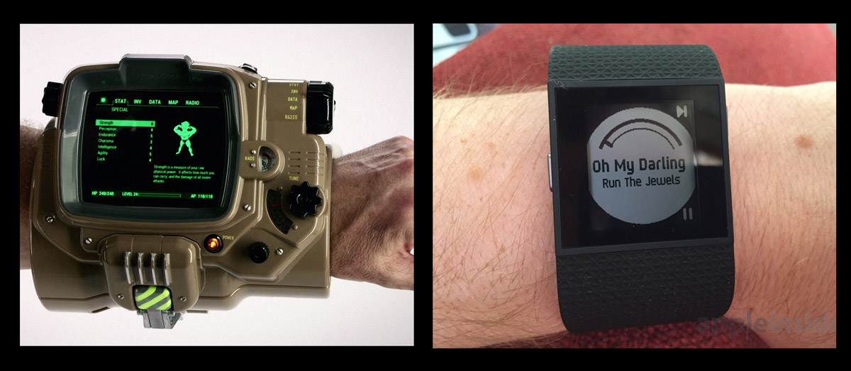
Various policies like that regarding what you can and can’t do with your own data left a bad taste in my mouth, so I went with Jawbone. I also enjoyed the fact that Jawbone products stay away from the “Pipboy” aesthetic many activity trackers are adopting (I’m looking at you, Fitbit Surge).
Let’s get to the data. Jawbone does allow you full access to your data, but they limit your minute-by-minute data to queries through their API. Otherwise, you are limited to daily summaries of your total step count. Thus, I wrote a python script access my account and download the past years worth of data. Here is a sample of what the data look like (this may not all be visible on mobile):
| epochtime | date | time | time_completed | steps | distance | speed | calories | active_time | devicetype | measuretime |
|---|---|---|---|---|---|---|---|---|---|---|
| 1.447e+09 | 2015-11-12 | 19:23:13 | 19:24:17 | 42 | 26 | 0.406 | 1 | 0 | up3 | 64 |
| 1.447e+09 | 2015-11-12 | 19:22:09 | 19:23:13 | 6 | 3 | 0.047 | 1 | 0 | up3 | 64 |
| 1.447e+09 | 2015-11-12 | 19:21:04 | 19:22:08 | 11 | 7 | 0.109 | 1 | 0 | up3 | 64 |
| 1.447e+09 | 2015-11-12 | 19:00:20 | 19:01:25 | 14 | 8 | 0.123 | 1 | 0 | up3 | 65 |
| 1.447e+09 | 2015-11-12 | 18:59:15 | 19:00:19 | 11 | 7 | 0.109 | 1 | 0 | up3 | 64 |
| 1.447e+09 | 2015-11-12 | 18:58:09 | 18:59:14 | 13 | 7 | 0.108 | 1 | 0 | up3 | 65 |
Jawbone provides the epochtime, time_completed, steps, distance, speed, calories, and active_time. The python script I wrote then adds the more human-readable date and time columns (for those of us who don’t think in Unix), as well as the measuretime column (which is calculated by the difference between time_completed and time). The devicetype column I have added solely for this analysis, and goes by date ranges given below.
If anyone expresses interest, I will upload the python script I used to download the minute-by-minute data.
JAWBONE UP3 vs JAWBONE MOVE vs APPLE IPHONE
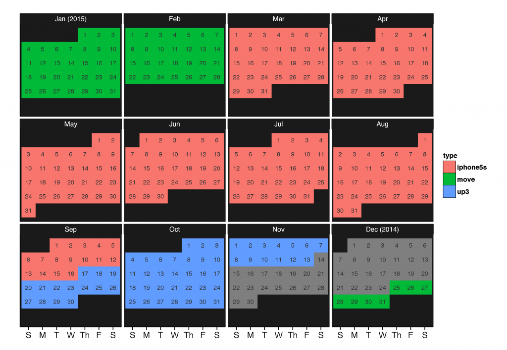
I am comparing three devices: The iPhone 5S, Jawbone Move ($25-50), and Jawbone UP3 ($120-180). I wore the Jawbone Move from 12/25/14 to 3/2/15, when it fell off my belt during a physics conference (the ease of losing the Move is one of the most common complaints against it in online reviews). At that point, movement data was recorded with my iPhone 5S until 9/16/15, when I purchased the Jawbone UP3 (shortly after they enabled their passive heart rate feature). Here is a calendar detailing what device was worn when (this data set ends at 11/13/15):The number of individual measurements taken with each device during these periods was:
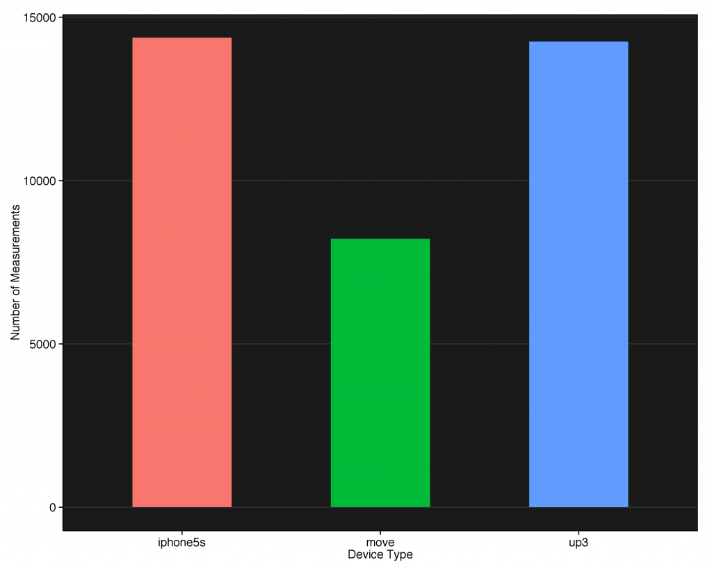
In 67 days with the Move, it collected approximately 8000 individual measurements. The iPhone 5S and UP3 both collected approximately 14000 measurements, but the iPhone did so over 199 days while the UP3 collected that many in 57 days. So, for measurements per day, we get approximately:
- iPhone 5S: 70 measurements/day
- UP Move: 119 measurements/day
- UP3: 245 measurements/day
The fact that the dedicated devices sample at a higher rate than the iPhone is not surprising, considering they never have to prioritize making a phone call or instagramming your sweet sushi plate. The difference in sampling rates between the UP Move and UP3 is more subtle and will become clearer as we delve deeper into the data.
First, let me state some of the limitations of this analysis: We do not know the measurement truth behind this data, so we cannot say anything truly conclusive in comparing the three devices (since they were taken at different periods). However, knowing that my walking movement behavior isn’t remarkably different from day to day, we will assume that the movement behavior was approximately the same between devices. This means that any major differences we see we will attribute to the device, not the movement data.
The other major limitation is that all of this data came from the Jawbone API, so potentially Jawbone could deliberately or unintentionally be degrading the iPhone data to make it’s activity trackers look more attractive. I will just assume that isn’t the case.
First, let’s look at a simple histogram of the total steps taken over the entire time period:
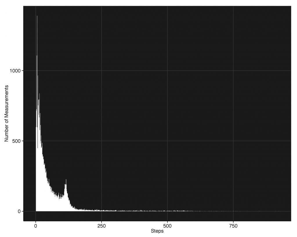
We see a bi-modal distribution, with a peak at zero and another at approximately 120 steps. This second peak is odd, and to figure out what’s going on let’s plot the same histogram broken up by device-type.
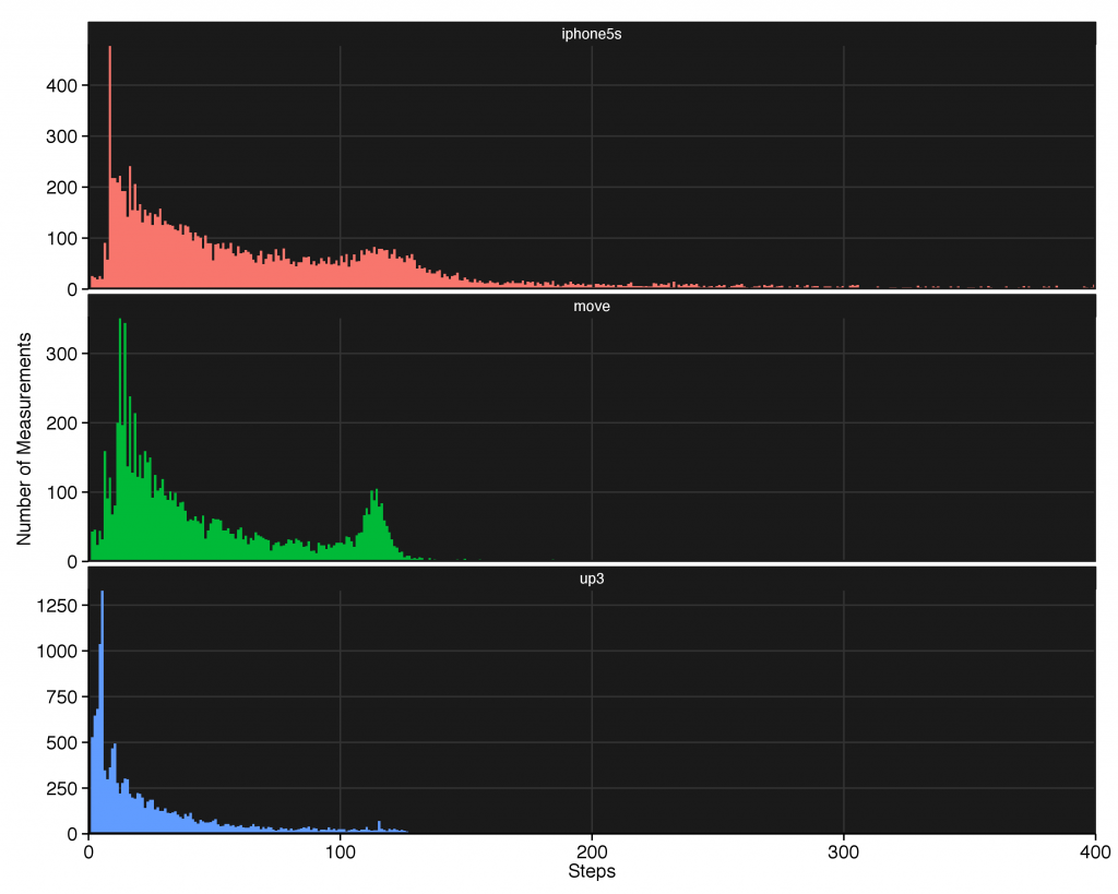
We see the peak is not present in all of the devices, so it’s most likely just an artifact from the way the Move (and to a lesser extent, the iPhone 5S) samples the step data. We also see the iPhone and the Move rarely sample when there are fewer than 10 steps. Contrast this with the UP3, which does show some abnormal binning behavior (demonstrated by the bumps at various step counts) at low step counts but has plenty of sub-10 step count measurements. We can also see that the iPhone is responsible for most of the high-step counts, none of which are present in the dedicated devices. This is our first hint at what paying more gets you: more fine-grained measurements.
Let’s look at a histogram of the speed and see if there’s anything interesting there.
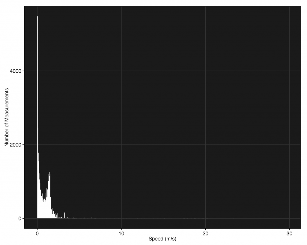
Another bi-modal distribution, with some outrageously high outliers. Unless I’m an Usain Bolt-level sprinter and I don’t know it, I’m pretty sure these data points are not real. So let’s first focus on the real data (I’ve tried to figure out if there’s any satisfying way to explain the high speeds, but it looks like it’s just hardware issues). Breaking it up by device-type in a stacked histogram and zooming in on the data, we get:
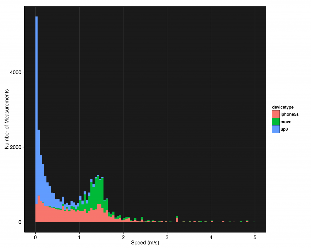
The second peak is almost entirely due to the Up Move. The iPhone 5S samples consistently from 1.5mph and below, while the UP3 has many measurements telling me my speed is zero. To see this more clearly, let’s separate the histograms (this time overlaid):
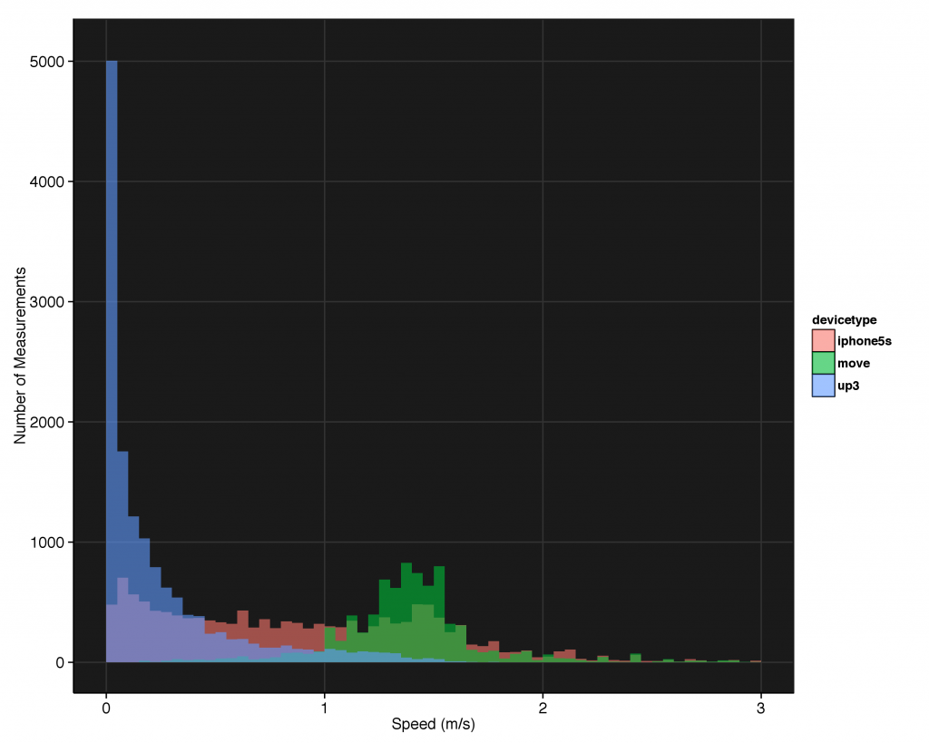
The UP Move is aptly named: It doesn’t record steps unless you’re moving at a significant pace. The UP3, on the other hand, seems to be constantly sampling regardless of your behavior. This sampling scheme used by the Move is probably a design constraint related to battery life: one of it’s main features is the ability to last 6 months on a single watch battery. Each time in communicates with the iPhone over bluetooth to send a movement, it uses up some of that battery. Thus, not sending a measurement until a certain minimum amount of movement has occurred makes sense from a design perspective. The UP3, on the other hand, is designed to be recharged every week or so and thus can sample at times where not much movement is occurring.
Speaking of sampling times, let’s look and see how the measurement period (the time in which the device collected the steps before logging the data to the API) varies per device.
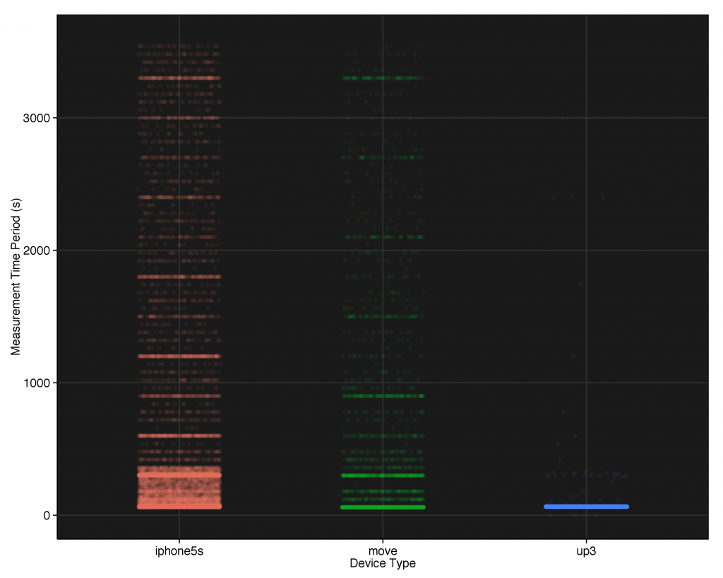
The iPhone and Move both show highly variable measurement times, while the UP3 is rock solid at 60-64 seconds per measurement. The iPhone samples anywhere from 1 minute to 60 minutes, preferentially sampling in 5-10 minute blocks and at any time between 1-5 minutes. The Move is slightly more consistent in that it only samples on the minute, but it still has measurement periods up to 60 minutes long. The UP3 always samples at 60-65 seconds, regardless of speed or distance (the few non-60 second measurements are from the overlap day switching between devices). Here’s the most stark example of what spending more gets you: more consistently timed measurements.
These devices all estimate distance as a function of steps, as well. Let’s see what plotting that gives us.
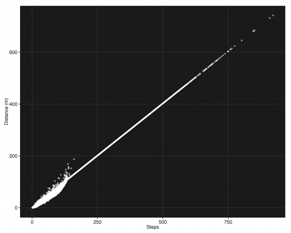
We see one long linear branch and some less-linear looking behavior down below 200 steps. Again, let’s split it up by device and see what’s going on.
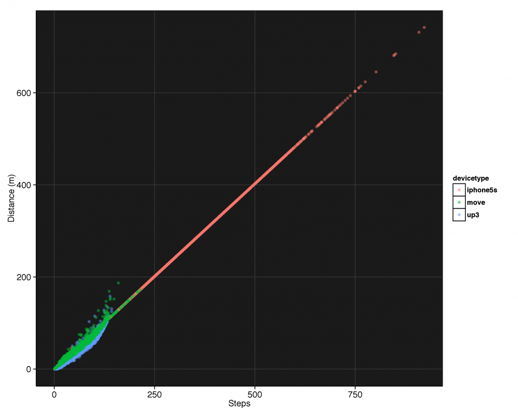
The iPhone is responsible for the long linear branch. If you took away the Jawbone products, you would see this extended all the way down to the origin. Both the Jawbone products, on the other hand, do not have such a simple one-to-one relation between step count and distance. Both of these products utilize algorithms that take into account your pace and speed to give a better estimation of your movement. The iPhone, on the other hand, can’t tell if you’re walking or running–just that you’ve taken X steps. It simply multiplies your number of steps by your estimated stride length. Thus, it will misjudge your distance when you’re running (or moving really slowly for some reason). So we’ve hit another difference between the price points: better distance estimation.
Let’s zoom into the UP3 and Move data.
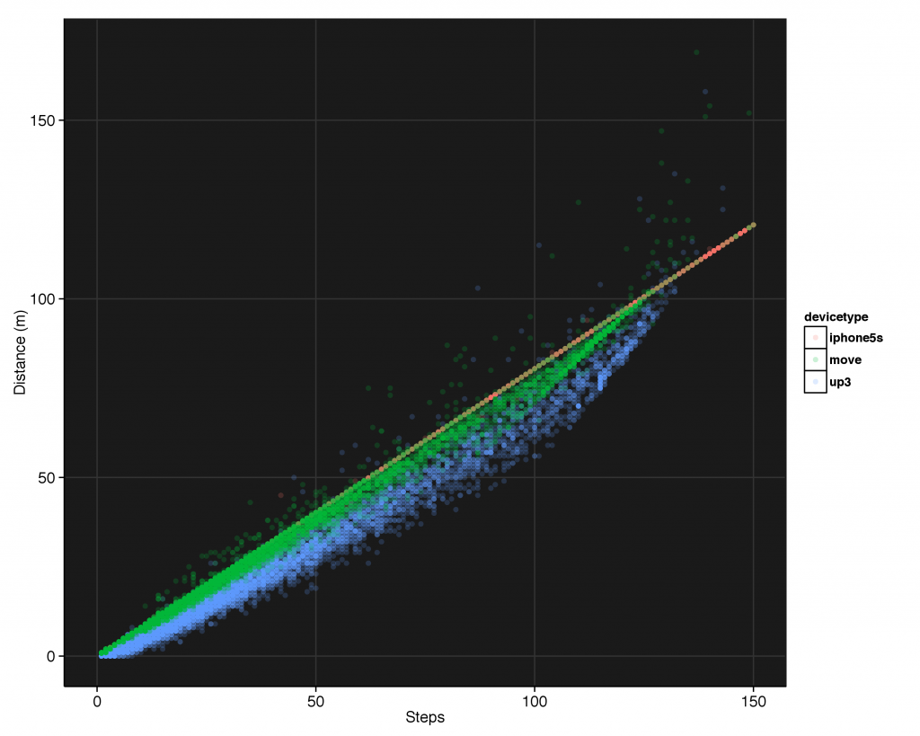
The UP Move data shows less variability in the distance to steps measurement than the UP3, and the iPhone shows no variability. This means either my walking behavior became more variable when I wore the UP3 (not likely), or that the Move does not record movements with the same fidelity as the UP3 (more likely).
The data also includes the amount of active time in each measurement period. This is the amount of time in that period that it actually records some sort of movement.
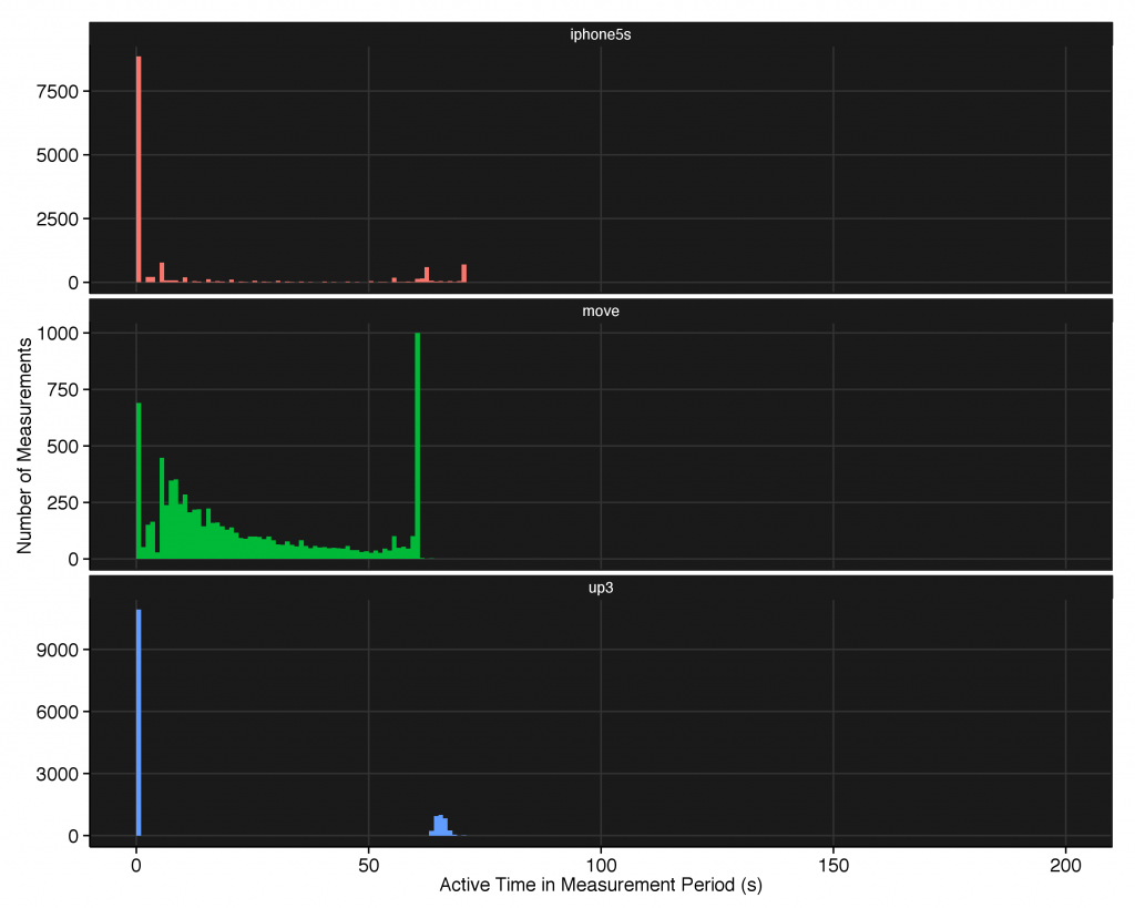
All three devices show a large spike around 0, but the iPhone and the UP3 seem to make the majority of measurements as having active_time = 0. The Move, on the other hand, has far fewer zero measurements, as it only logs a measurement when you have some minimum amount of active time (note the dearth of measurements below active_time=5 where we would have expected more measurements based on the power-law like behavior above active_time=5). This might explain some of the more variable total measurement times we saw above. There is probably a rule where the move doesn’t transmit the data to your phone if the active_time is below 5 seconds or so, in order to save battery life. Yet another reason why it lives up to it’s name.
Let’s take out the zero measurements so we can see the behavior of the iPhone and the UP3.
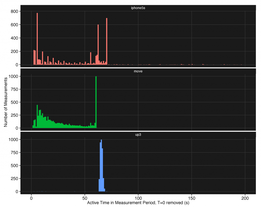
The large amount of data around active_time=60 for the Jawbone products is due to the definition of the measurement, which is the amount of active time in a single period. Since the measurement periods for the jawbone products are 60 seconds (except if you’ve only moved a step or two for the Move), of course there’s a spike at 60 if you continuously walk for more than a minute. The UP3 either records 0 active time or 60-65, which leads me to believe that all it’s doing is determining if you were moving the entire measurement period. I suspect they then use this to detect if you were exercising (which is an automatic feature) by noting a continuous series of active_time measurements.
Let’s now look at steps as a function of speed, with the points colored by distance.
Before I plotted this, I expected to see a rough trend showing that the faster I was moving, the more steps I was taking and the further I was going due to my increased pace. Instead I got:
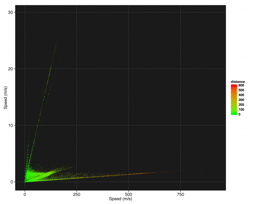
Odd. Why are there linear branches shooting off at various angles? Let’s break that down by device.
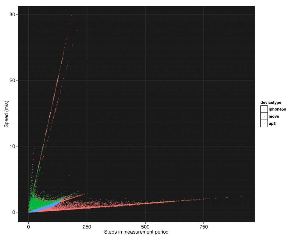
So we see here the iPhone is responsible for all of the high step counts as well as all of the outrageously high speeds. The high step measurements at low speed are to the long sampling times (shown by the increasing distance in the branch from the previous graph). We will split this data up by measurement time (for reasons that will be clear shortly): measurements with measure times below 70 seconds, and those above.
Here is the speed vs steps plot for the short measurements (colored by the amount of active time):
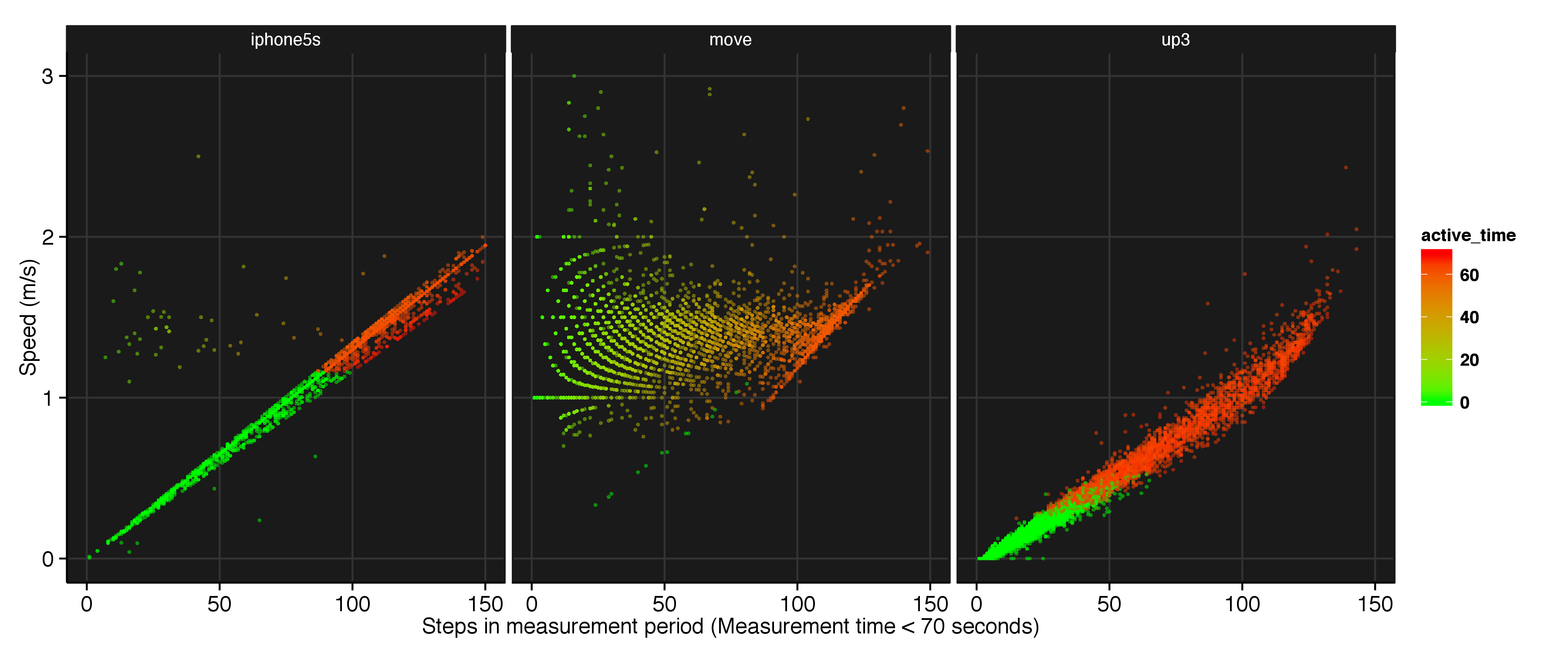
The short measurement time behaviors are all markedly different. The iPhone simply calculates speed as a linear function of the number of steps taken in a given measurement period (ignore the vertical data to the left, it comes from the overlap day where I used both an iPhone and the Move). If you exceed 1.2m/s, your total active time switches from 0 to 60 seconds. This binary response probably is used to calculate periods of constant movement so the UP app can automatically detect your workouts.
The UP3 graph is actually the same as the distance vs steps graph, just scaled down by the UP3’s constant total measurement time. Like the iPhone, it’s uses active_time here as a binary response. Unlike the iPhone, the transition between constantly active and inactive isn’t as sharp, as the UP3 is taking more than just your step count into account.
The UP Move graph confused me for a while until I figured out it’s actually calculating speeds at measurement periods below 360 seconds with active time, not measurement time. The Move samples one speed measurement for each step, with a resolution of one meter per second. In order to get higher resolution data, it needs to take all these individual speed measurements within one period and average them. To demonstrate this, let’s say every step has one of two speeds associated with it: one or two meters per second. If your speed for that step is closer to 1m/s it reads 1 m/s, and if it’s closer to 2 it reads 2 m/s (basically, a rounding approximation). For each different number of steps, there is then a different number of possible averaged speed measurements:
- 1 step: 1, 2
- 2 steps: 1, 1.5, 2
- 3 steps: 1, 1.33, 1.66, 2
- 4 steps: 1, 1.25, 1.5, 1.75, 2
- 5 steps: 1, 1.2, 1.4, 1.6, 1.8, 2
As the number of steps increases in the measurement period, so does the resolution of the data. Simulating this sampling strategy, we produce this distribution of speeds:
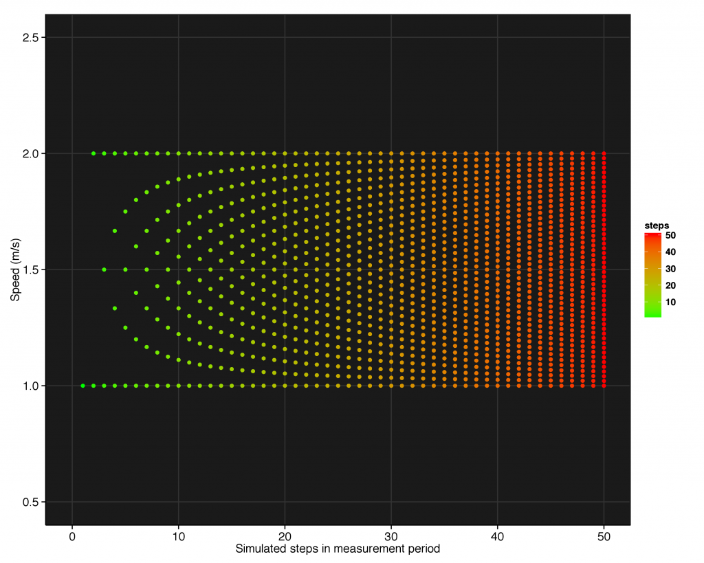
recovering the behavior we see in the data. We can now explain the discrete spacing of the data on for low speeds.
Now knowing how the Move calculates speed, we can see the UP Move has a speed resolution of 1 m/s. Let’s take our newfound knowledge at look at the greater than 70 second data (colored by measurement time instead of active time):
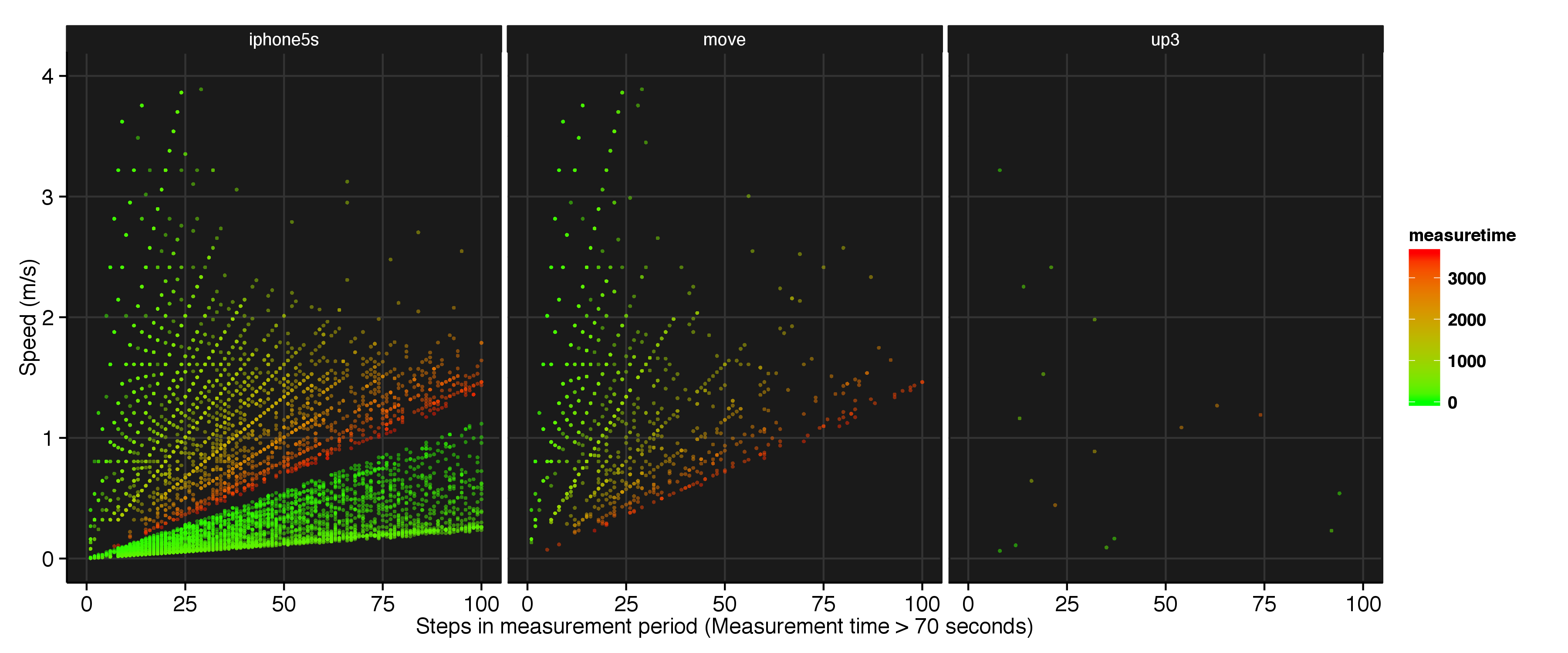
This peculiar averaging behavior is present on the iPhone too! Except here it has a resolution of 0.8 m/s (as determined by the horizontal lines), and is calculated with the measurement time, not the active time. Some of the data (shown in the bright green) is also taken in the same method as the short measurement period.
The same behavior is seen on the UP Move (switching from 1 m/s resolution to 0.8 m/s) which leads me to believe that all the Move data with a measurement time greater than 70 seconds is actually coming from the iPhone. I suspect this both because prior to releasing the UP3, Jawbone had one app that both interfaced with all of the Jawbone products as well as the phone’s accelerometer. If the phone couldn’t find the Move, it could possibly just start using the phone’s internal accelerometer. I haven’t been able to verify this, however.
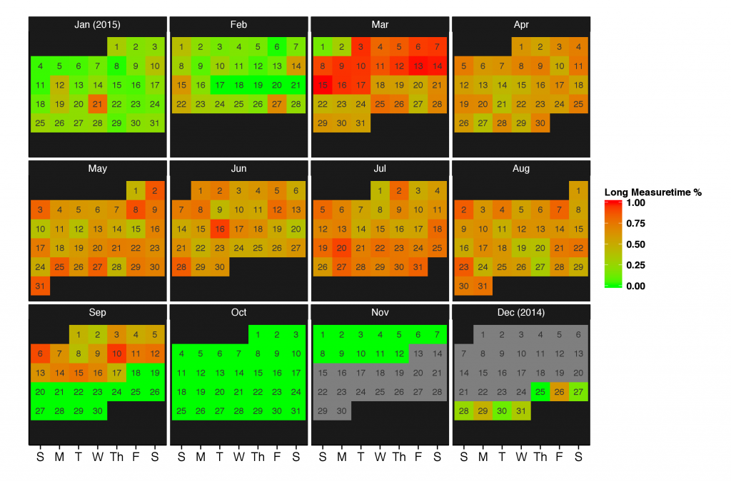
Finally, The UP3 has no data here, as it samples consistently at 60-65 seconds. I’ve graphed here the ratio of long measurement times to the total number of measurement times for each day, and you can see clearly when I switched devices solely based on this metric. At least 50 percent of the iPhone’s measurements fall within the long measurement category, while the Move is consistently shorter and the UP3 is completely rock solid in its measurement times.
Finally, you can actually use the distance and measure-time supplied with the Move in order to calculate a speed distribution exactly like the UP3 (as this is how the UP3 calculates it). Extracting all the sub-70 second measurements (e.g. the Move data that are definitely not the iPhone data in disguise) and calculating this quantity, we get:
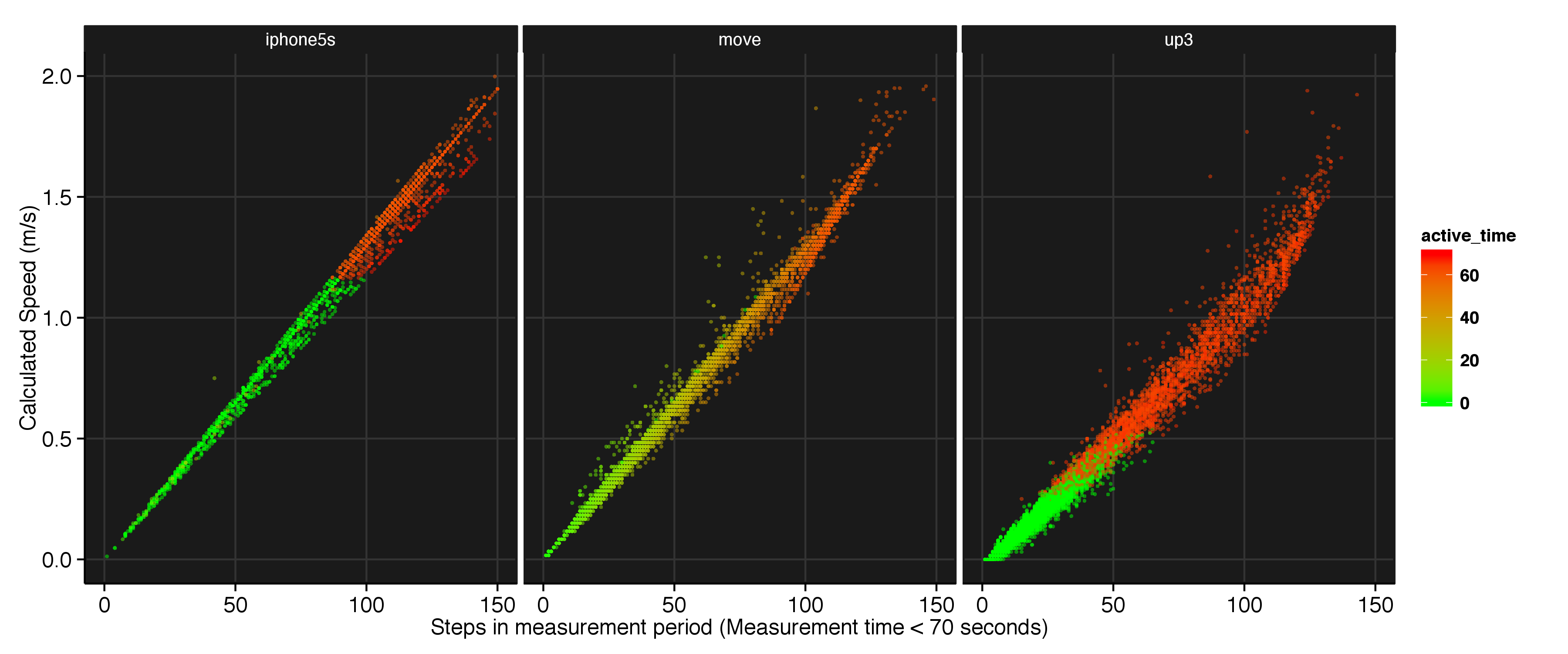
which then recovers a similar distribution to the UP3.
SUMMARY
What device should you get? If you want a device that simply gives you an indication of your general activity level, your phone should be fine. There is no major difference between the phone and dedicated devices in their ability to track steps (see the JAMA paper). However, if you’re interested in getting a more accurate tally of your distance walked and the intensity of your exercise, a dedicated tracker would probably fit your needs better.
Truthfully, the biggest benefit of spending more are the additional features and the form-factor : it’s not as easy to run with an iPhone as it is with an UP3 or Move. The UP3 and Move both track sleep, and the resting heart rate measurement that the UP3 provides has actually changed my sleeping habits pretty dramatically (who knew a single beer can consistently raise my resting heart rate 10 bpm and impact my sleep quality even when I make sure to stay well-hydrated?). Jawbone eventually promises more features for the UP3, including body temperature and hydration. Whether or not they will deliver on those promises remains to be seen, but so far I am happy with my purchase.